U.S. Web Design System
A scalable design foundation built for consistency, clarity, and federal compliance.

U.S. Web Design System
Overview
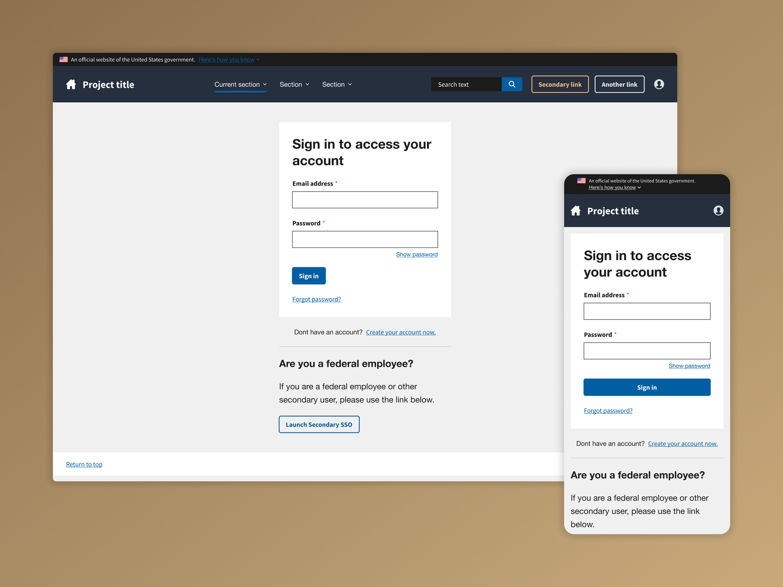
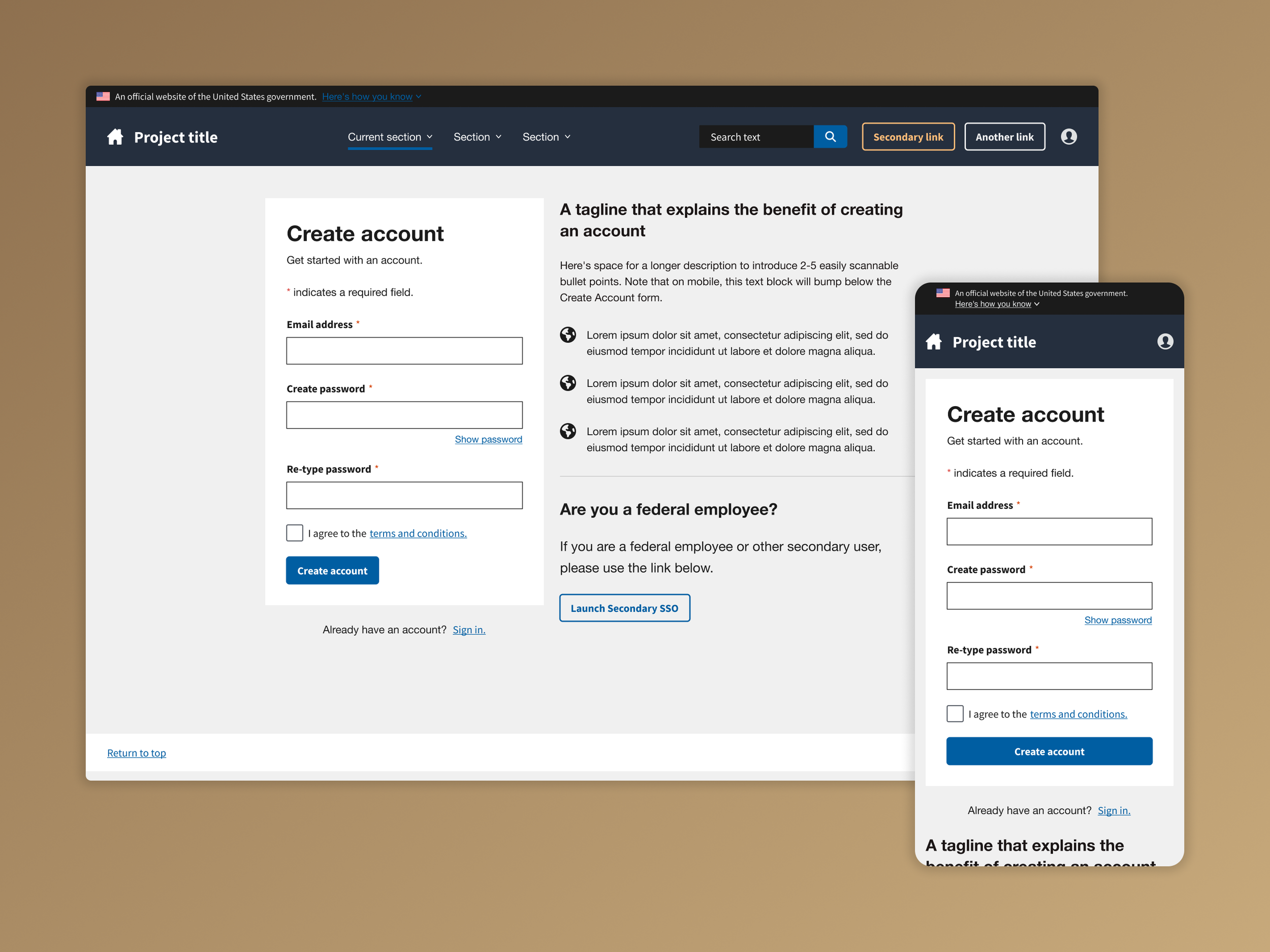
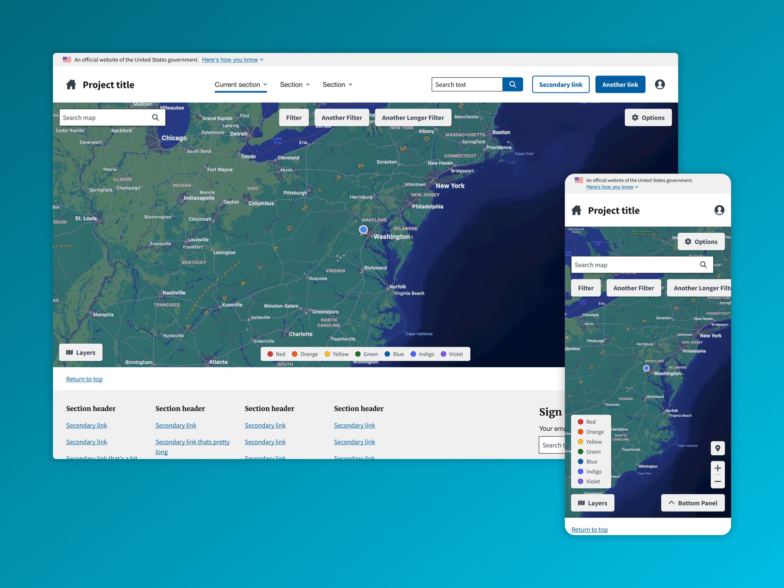
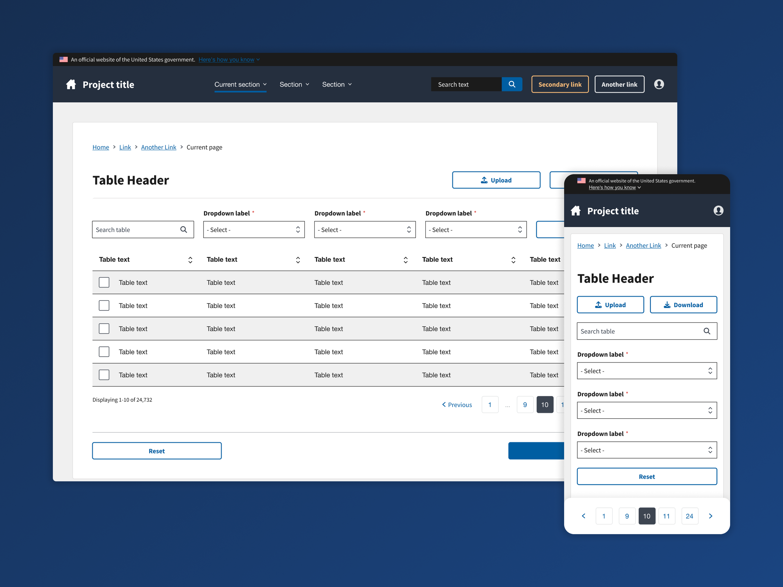
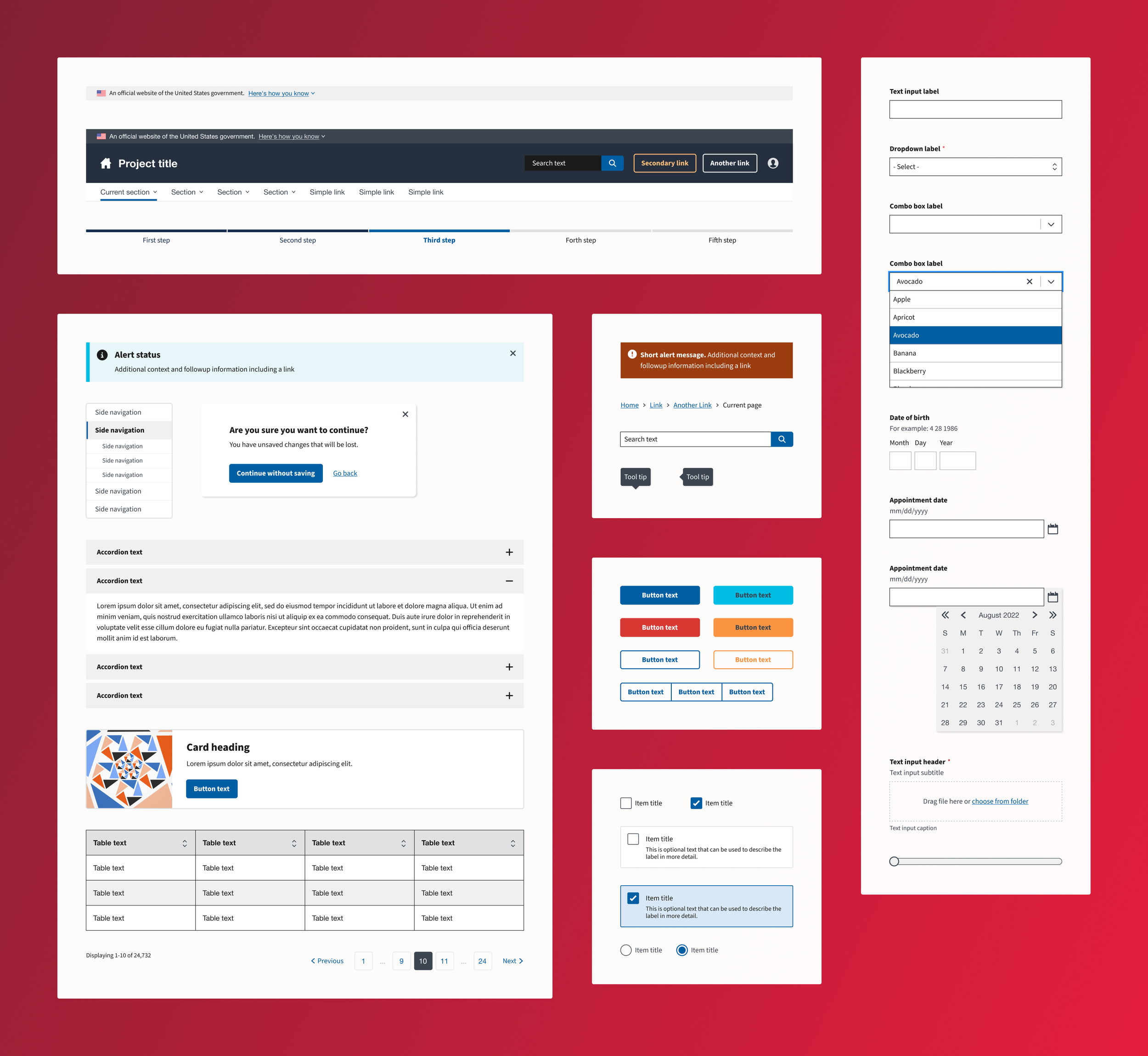
The U.S. Web Design System (USWDS) provides a standardized design language for federal websites and applications. To support faster, more consistent implementation across CMS projects, a Figma-based USWDS Design Kit was created and maintained as a shared resource for designers, developers, and product teams.
This kit served as the foundation for designing compliant, accessible, and visually cohesive user interfaces across multiple government applications.
Problem / Solution
While USWDS offers a robust component library in code, design teams lacked an organized, up-to-date source of truth in Figma. This created inconsistencies across projects, slowed down prototyping, and introduced friction between design and development teams.
A centralized design kit was created in Figma to:
Translate official USWDS components into accurate, scalable design assets
Establish clear naming conventions and documentation for shared use
Align design assets with real-world implementation patterns used in CMS projects
Enable faster mockups and collaborative workflows across UX teams
Reduce design debt by improving visual and functional consistency across systems
UX Considerations
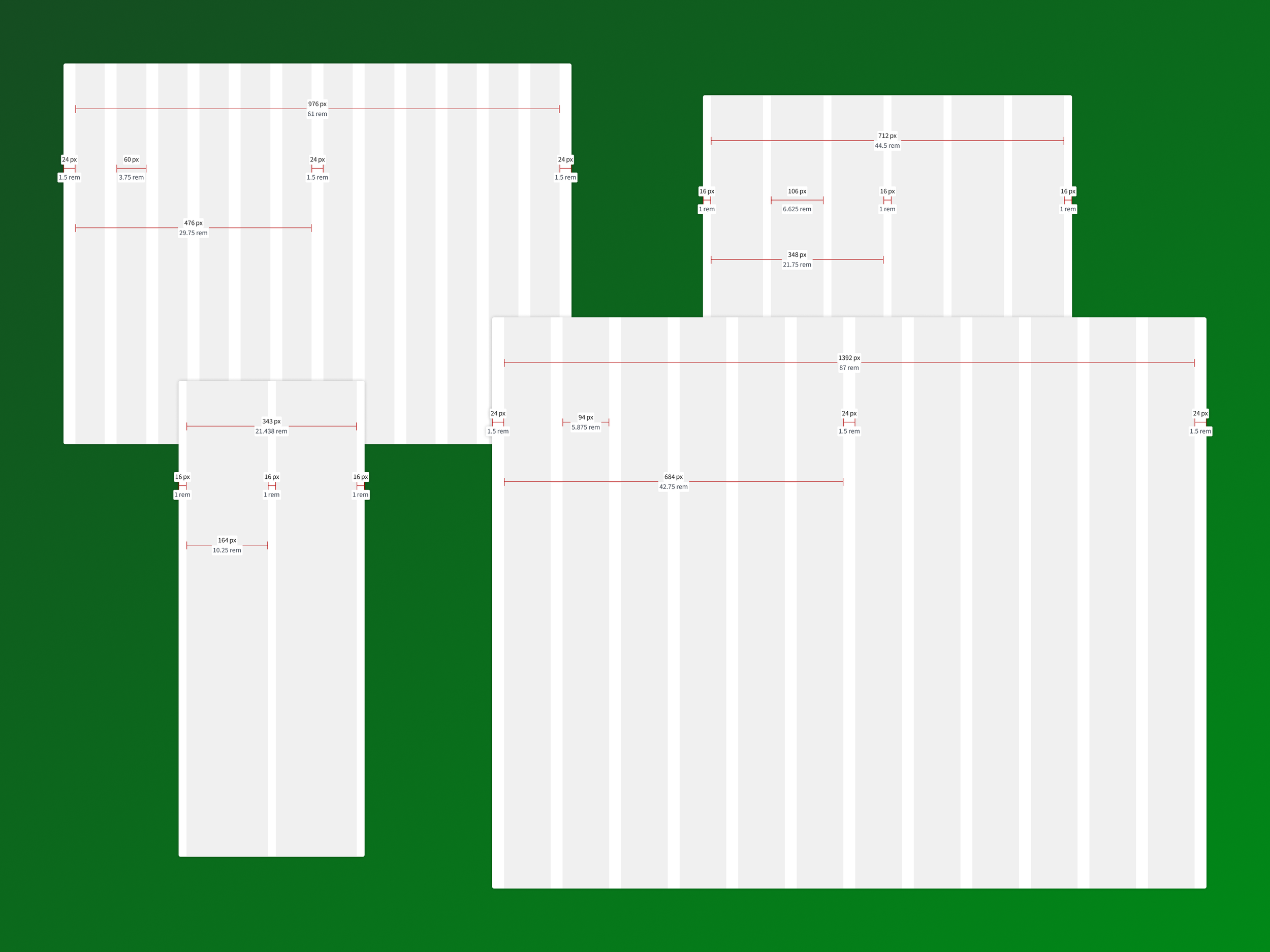
System parity: Ensured component structure in Figma matched USWDS codebase and CMS-specific styles, improving design-to-dev handoff.
Accessibility alignment: Included proper contrast, spacing, and focus indicators in components to support WCAG compliance.
Reusable structure: Organized the kit into nested components and variants to support efficient, scalable UI building.
Team collaboration: Structured the file for multi-project access with intuitive naming and documentation for easier onboarding.
Visual fidelity: Maintained pixel accuracy to reduce confusion and eliminate the need for redundant styling at the implementation stage.