Center for International Policy
A bold, accessible print piece designed to inform, mobilize, and grow support for foreign policy.
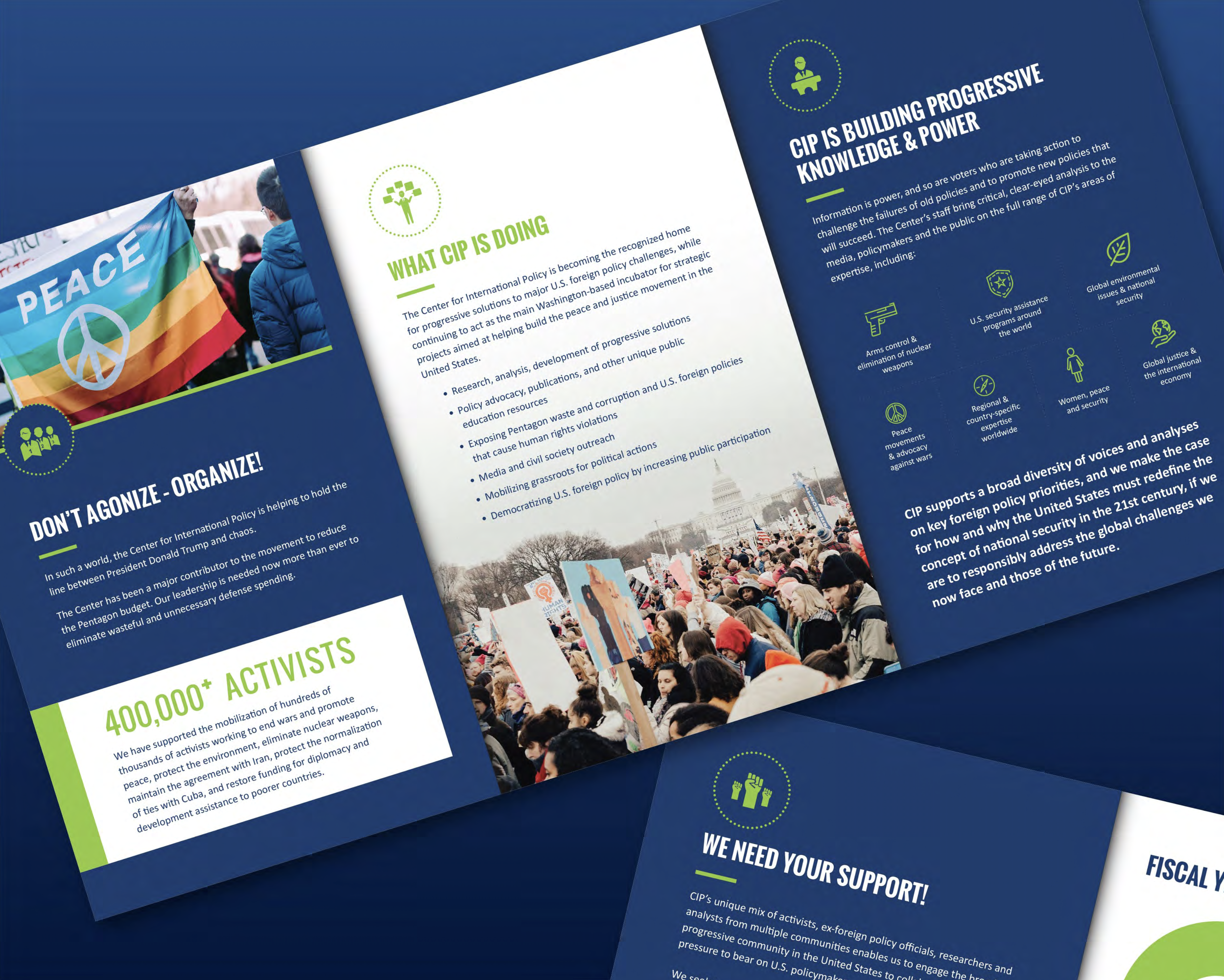
CIP Brochure
Overview
This promotional brochure for the Center for International Policy (CIP) was designed to communicate the organization’s mission, policy initiatives, and impact to potential supporters, donors, and activists.
Blending vibrant imagery with infographics and accessible copy structure, the design supports quick skimming and strong emotional resonance — ideal for conferences, mailers, and outreach events.
Problem / Solution
CIP needed a modernized communications piece that reflected their evolving platform, diverse policy focus areas, and the energy of grassroots activism. Their existing print materials lacked visual consistency, weren’t scalable for updated campaigns, and didn’t effectively highlight their key impact areas.
The new brochure was designed to:
Tell the story of CIP’s influence and advocacy using large visuals and strong section headers
Simplify their complex areas of policy focus through iconography and digestible layout
Emphasize key statistics (like number of supporters) with high-contrast visual treatment
Balance professional tone with activist appeal — speaking to policymakers and grassroots audiences alike
Create a flexible visual system that could extend across future materials
Design Considerations
Accessible layout: Hierarchical typography and clear breakpoints supported both full reads and quick scans
Color for action: A bold palette of blues and greens reinforced the brand while guiding eye movement
Icon-based navigation: Policy areas were visualized with clean icons to help readers understand breadth at a glance
Modular grid system: Design follows a repeatable modular structure, allowing for future content swaps or repurposing
Emotionally resonant: Photography was chosen to reflect real action and advocacy, building reader trust and connection