Bootstrap
A scalable, pixel-perfect UI library built for rapid prototyping and custom theming.
Bootstrap Design Kit
Overview
This design kit was created to bring structure, clarity, and visual consistency to digital projects using the Bootstrap framework. Built entirely in Figma, it mirrors the core components and grid system of Bootstrap 5, while providing additional UI enhancements, responsive layouts, and color theming options. The kit empowers designers and developers to collaborate more efficiently — from wireframes to high-fidelity mockups.
Problem / Solution
Bootstrap is one of the most widely used front-end frameworks, but its visual documentation is code-first. Designers often recreate components manually, leading to inconsistent visuals, misaligned grids, and communication gaps.
This kit solves that by:
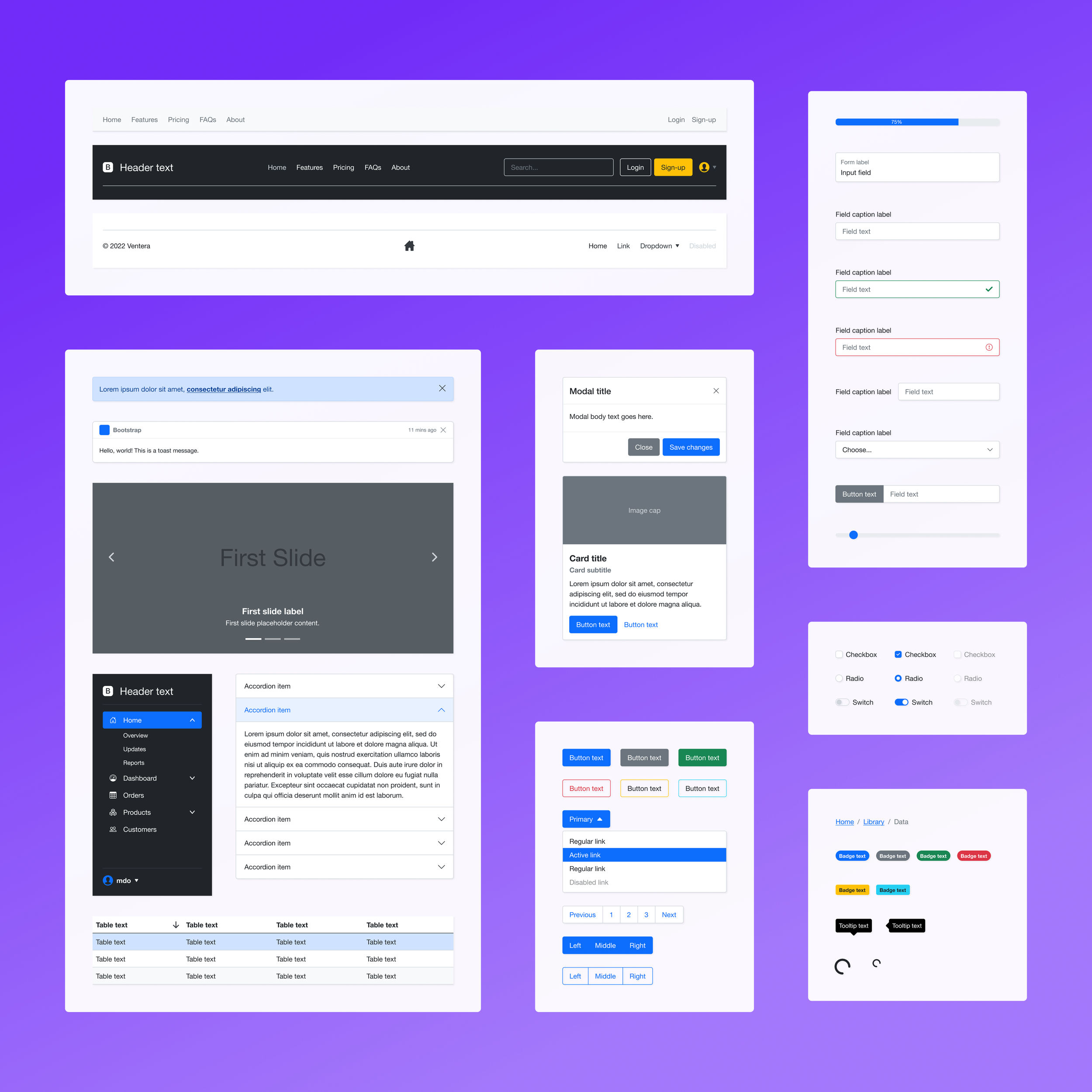
Replicating Bootstrap 5 components in Figma, with exact sizing, spacing, and states
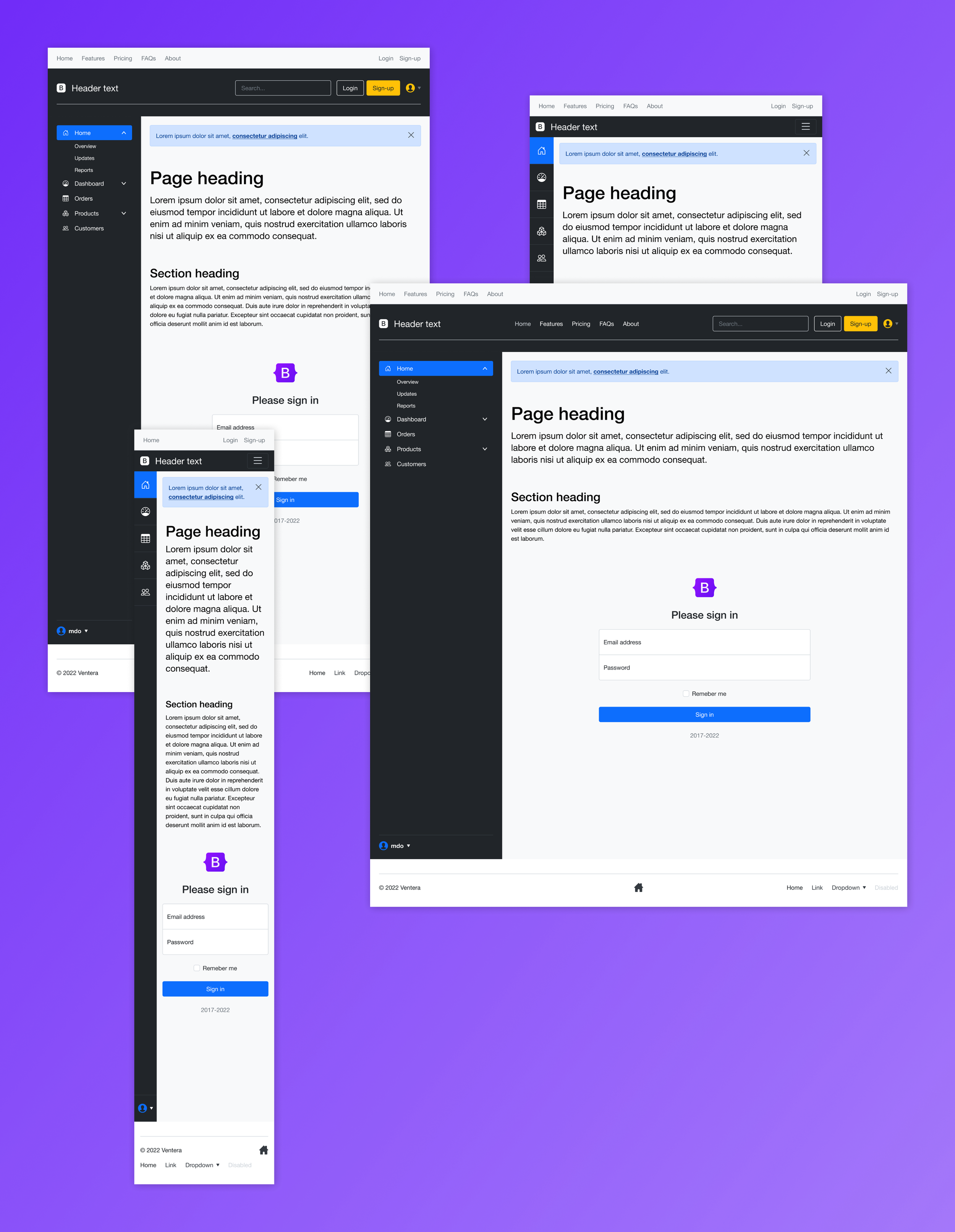
Including responsive breakpoints and grid templates for mobile, tablet, and desktop
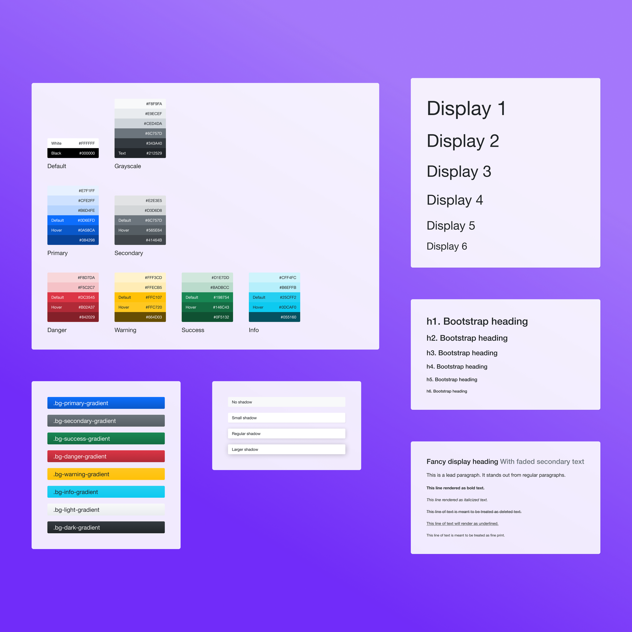
Extending Bootstrap's default styles with customizable color palettes and gradient tokens
Providing ready-to-use page templates and UI examples for faster prototyping
UX Considerations
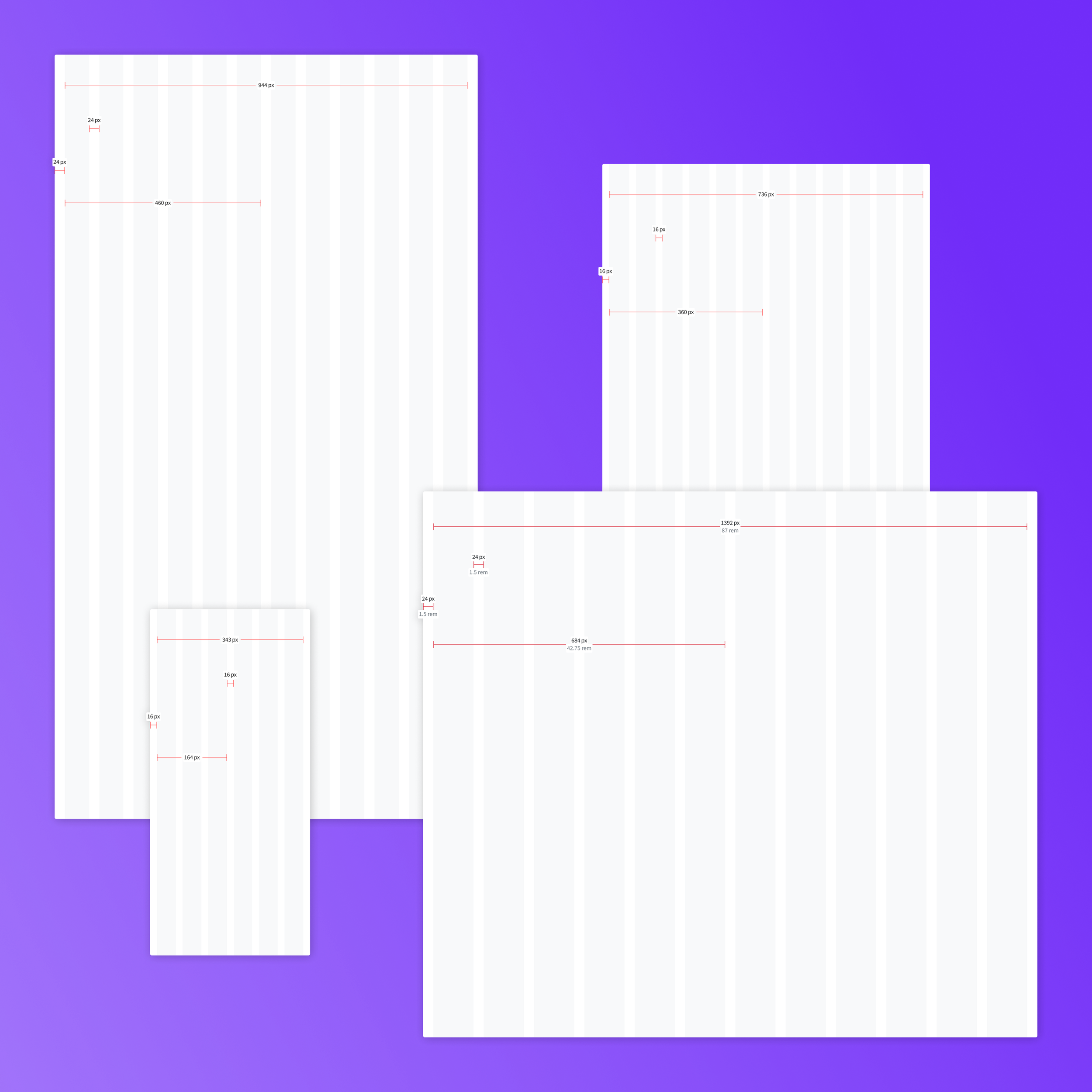
Grid fidelity: Matched Bootstrap’s column/grid behavior with redline overlays for pixel accuracy across screen sizes.
Consistent tokens: Defined typography, spacing, and color variables to ensure reuse and design harmony.
Dark mode-ready: Included light and dark variants of core components to support modern UI needs.
System-first structure: Designed the kit for scaling — from atoms and components to full-page layouts.
Developer handoff: Component names, sizes, and styles map directly to Bootstrap class conventions, improving communication and build efficiency.