TripIt
A redesigned mobile experience for organizing, tracking, and simplifying every trip.
TripIt Redesign
Overview
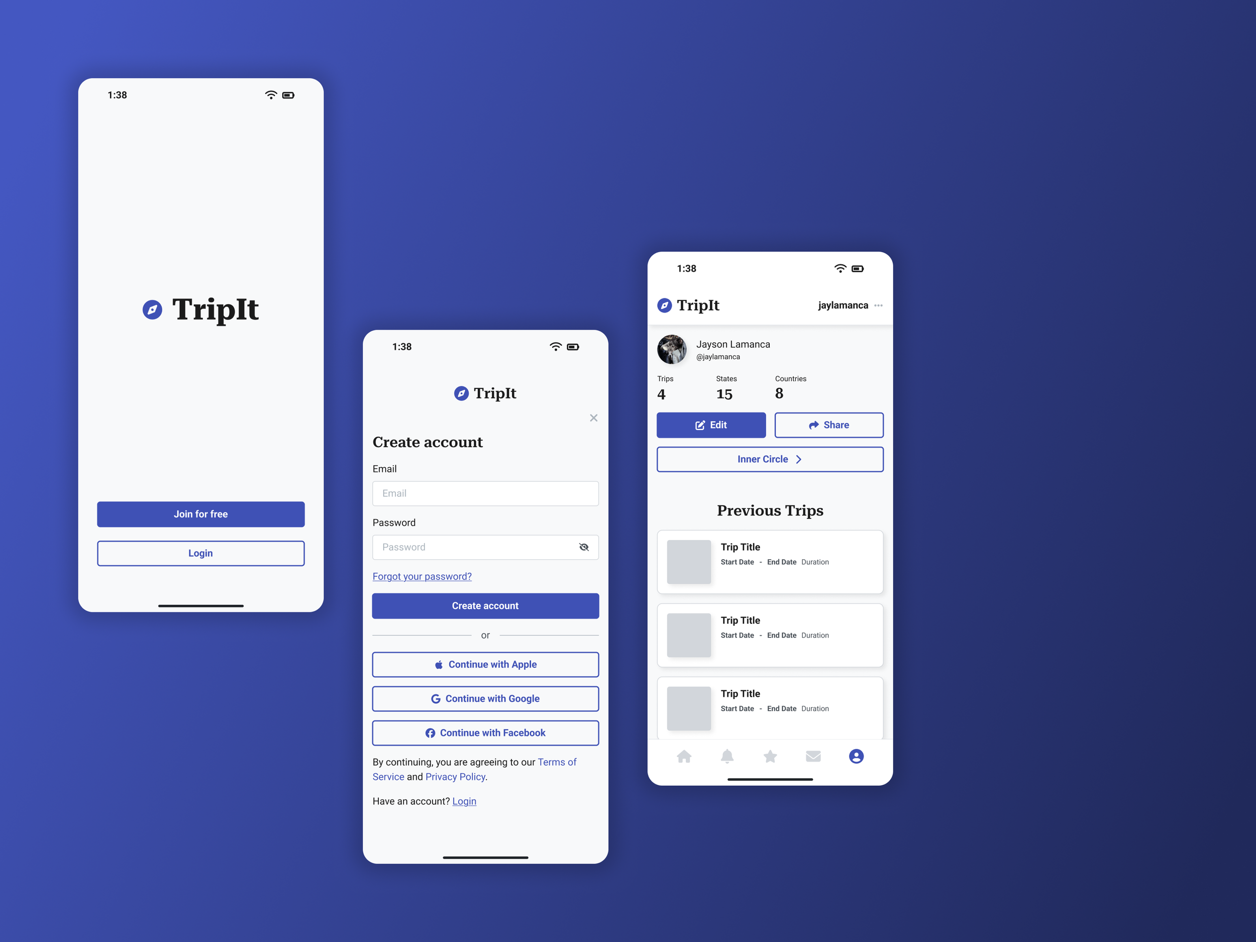
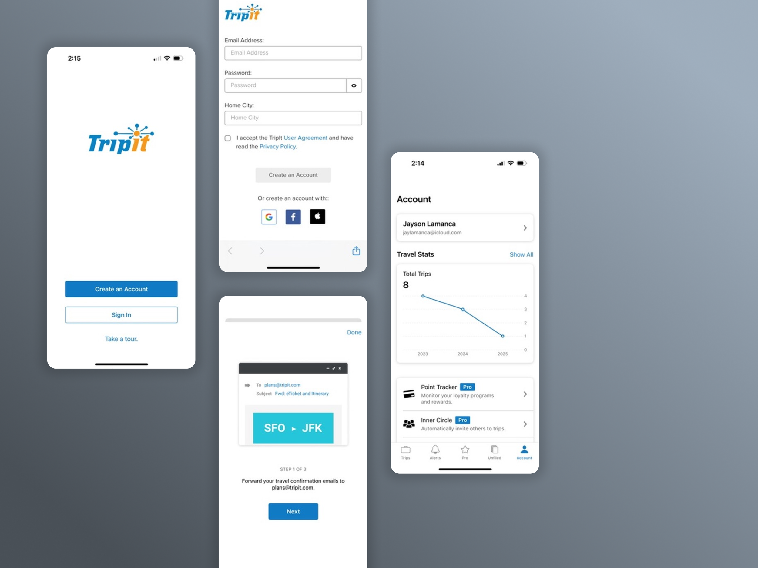
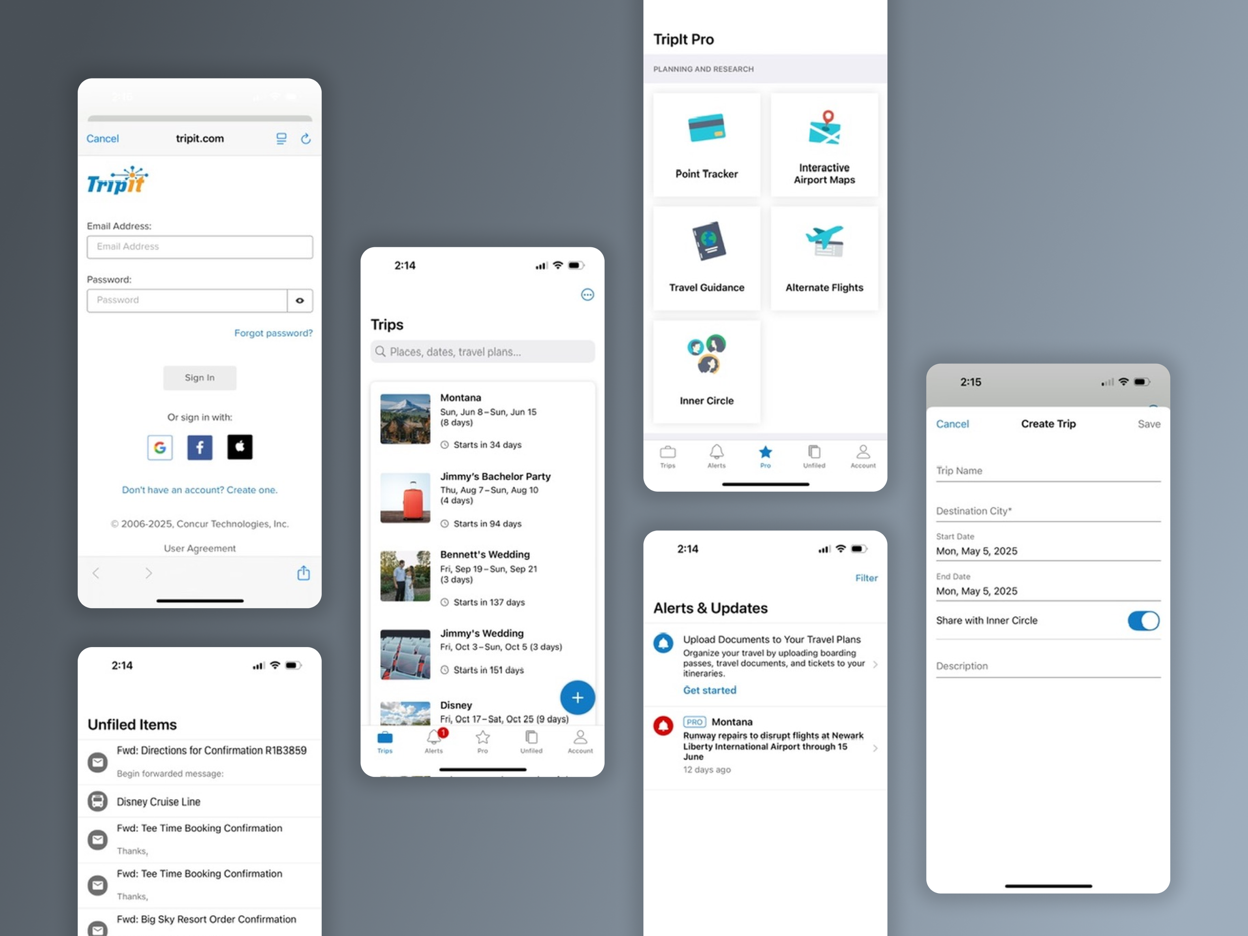
TripIt is a long-standing travel planning app that helps users manage trip itineraries, confirmations, and travel documents in one place. While functionally rich, its mobile interface felt visually outdated and difficult to navigate. This redesign reimagines TripIt for modern travelers — focusing on clarity, usability, and scalable UI design.
Problem / Solution
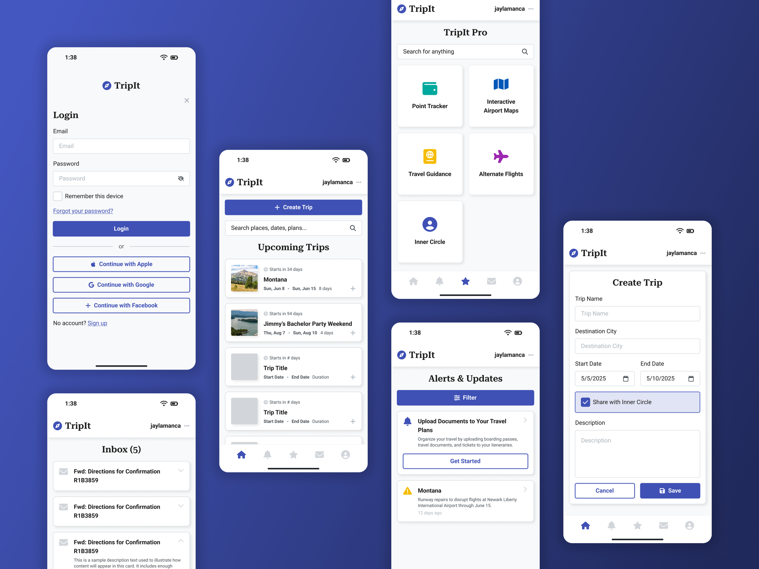
TripIt’s original interface suffered from dense layouts, low visual hierarchy, and dated UI patterns. Key user tasks — like viewing upcoming trips or navigating alerts — felt overwhelming and unintuitive, especially on mobile.
This redesign modernizes the experience through:
Streamlined login and onboarding flows
A card-based trip dashboard with cleaner information architecture
Simplified alerts and inbox sections for faster triage
Refined navigation and layout consistency across core tabs (Trips, Pro, Inbox, Account)
Scalable UI components with better readability and action clarity
UX Considerations
Mobile-first clarity: Designed each screen for at-a-glance readability and fast interaction, ideal for users on the go.
Card system for trips: Grouped travel details into consistent, tappable modules that surface key dates, duration, and context ("Starts in X days").
Accessible input flows: Cleaned up form structure for login, account creation, and trip setup to reduce friction and cognitive load.
Visual rhythm and spacing: Improved alignment, padding, and icon use to create a more breathable interface across devices.
Legacy audit-driven: All updates were informed by a side-by-side analysis of the legacy interface, targeting outdated interactions and layout inconsistencies.