Centers for Medicare & Medicaid Services
A Figma-based system supporting CMS applications with high-fidelity components, USWDS alignment, and scalable design patterns.

CMS Design Kit
Overview
The CMS Design Kit was developed in Figma to support consistent, high-fidelity interface design across a suite of internal tools managed within the Enterprise Systems Solutions (ESS) environment — primarily the HARP platform.
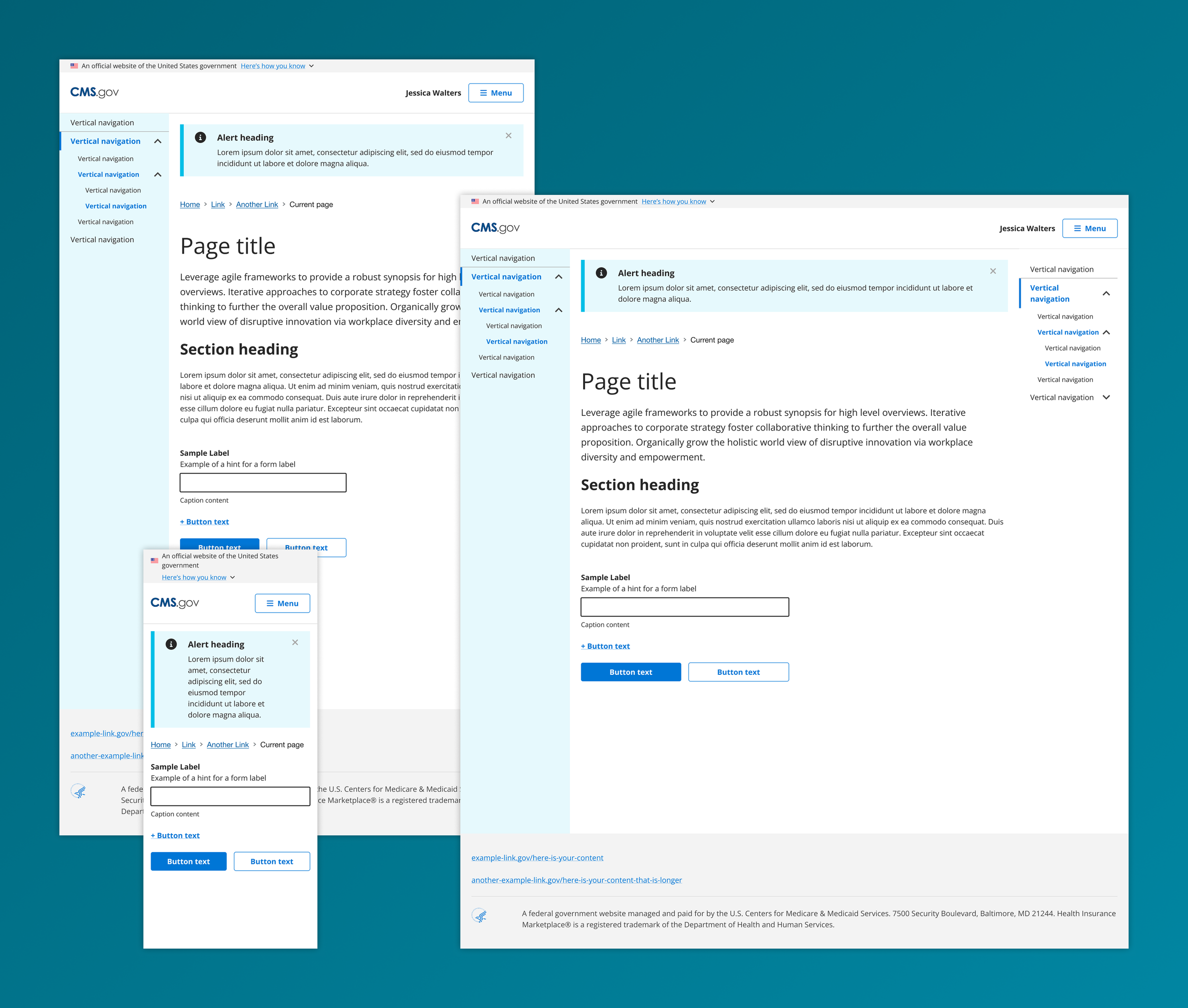
While rooted in guidance from the U.S. Web Design System (USWDS), the design kit introduced custom styles, structural conventions, and reusable components to better align with the functional and accessibility requirements of CMS applications. It became a critical asset for designers, developers, and stakeholders working across federal healthcare systems.
Problem / Solution
ESS teams designing internal CMS tools faced inconsistent design patterns, redundant effort in screen creation, and gaps between design and development. USWDS offered foundational guidance, but there was no centralized resource in Figma that reflected real CMS workflows, components, or implementation conventions.
The CMS Design Kit was built and maintained as a collaborative, scalable design system in Figma to:
Translate USWDS principles into usable, CMS-specific UI components
Provide accurate, high-fidelity design assets for efficient prototyping and development handoff
Unify patterns across teams working on HARP and other ESS tools
Improve accessibility, consistency, and visual clarity in all CMS digital products
Serve as a shared resource supporting long-term system growth and maintenance
UX Considerations
USWDS alignment: Incorporated USWDS tokens (colors, spacing, typography) while introducing CMS-specific structure and logic for real-world use.
CMS component library: Developed a wide range of reusable components and patterns including modals, tables, forms, alerts, headers, and navigation — styled specifically for CMS tools.
High-fidelity design assets: Created pixel-accurate screens for user flows across platforms, with emphasis on clarity, accessibility, and implementation feasibility.
Scalable architecture: Organized the kit with structured file naming, auto layout, and component variants to support shared use across multiple teams.
Cross-functional collaboration: Enabled faster design-developer alignment through clearly documented, consistent assets — reducing friction and improving output quality.